Resurrecting an old hack to build UI in GitHub READMEs
Almost exactly six years ago, I built Octo Ring, a webring for GitHub. I hadn’t thought about it at all since launch, so I was delighted to find that it collected over 1100 members on its own. It spread organically through the Markdown widgets that members are encouraged (but not required) to place on their profiles. You can see an example on mine:
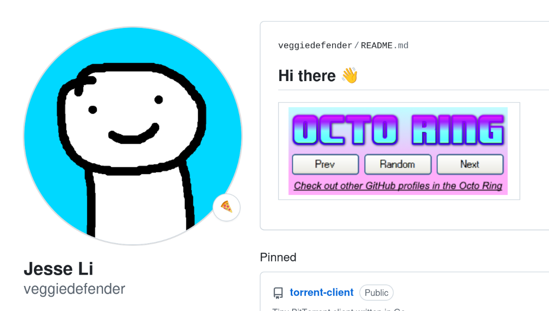
It’s a pretty standard badge, if a bit garish. The most surprising thing is that the buttons actually work! Prev, Random, and Next will each take you to different profiles. GitHub aggressively strips everything but a curated set of harmless HTML tags and attributes, precisely to stop you from doing this. Real buttons and CSS are out of the question; as are image maps, the other obvious way to accomplish the effect. After six years, I finally got around to writing up how I did it.
I used an old webmaster’s trick. Before we had such a nice variety of layout options, developers had to build UI by slicing images. The widget is made of five parts, and the challenge is gluing them back together in GitHub’s constrained environment:



Removing gaps
Luckily images already display side by side (inline) so we just need to set their widths using width and use <br> to start new rows. Then we can get rid of vertical gaps with align="top".
(Below, I’m displaying the code nicely formatted so you can read it, but the whitespace will add gaps to the actual layout. When you do this yourself, you should remove the newlines and spaces between elements.)
<a href="https://octo-ring.com/"><img src="https://octo-ring.com/static/img/widget/top.png" width="99%" alt="Octo Ring logo" align="top"></a>
<br>
<a href="https://octo-ring.com/p/veggiedefender/prev"><img src="https://octo-ring.com/static/img/widget/prev.png" width="33%" alt="previous" align="top" title="previous profile"></a>
<a href="https://octo-ring.com/p/veggiedefender/random"><img src="https://octo-ring.com/static/img/widget/random.png" width="33%" alt="random" align="top" title="random profile"></a>
<a href="https://octo-ring.com/p/veggiedefender/next"><img src="https://octo-ring.com/static/img/widget/next.png" width="33%" alt="next" align="top" title="next profile"></a>
<br>
<a href="https://octo-ring.com/"><img src="https://octo-ring.com/static/img/widget/bottom.png" width="99%" alt="check out other GitHub profiles in the Octo Ring" align="top"></a>
Constraining size
It’s enormous. If we wanted a full width layout, then we’d be done. And if we had used fixed pixel widths, then we wouldn’t have this problem at all, but we would encounter wrapping at small window sizes. To get the best of both worlds, we need a container. A table was the best I could find.
<table>
  <tbody>
    <tr>
      <td>
        <a href="https://octo-ring.com/"><img src="https://octo-ring.com/static/img/widget/top.png" width="99%" alt="Octo Ring logo" align="top"></a>
        <br>
        <a href="https://octo-ring.com/p/veggiedefender/prev"><img src="https://octo-ring.com/static/img/widget/prev.png" width="33%" alt="previous" align="top" title="previous profile"></a>
        <a href="https://octo-ring.com/p/veggiedefender/random"><img src="https://octo-ring.com/static/img/widget/random.png" width="33%" alt="random" align="top" title="random profile"></a>
        <a href="https://octo-ring.com/p/veggiedefender/next"><img src="https://octo-ring.com/static/img/widget/next.png" width="33%" alt="next" align="top" title="next profile"></a>
        <br>
        <a href="https://octo-ring.com/"><img src="https://octo-ring.com/static/img/widget/bottom.png" width="99%" alt="check out other GitHub profiles in the Octo Ring" align="top"></a>
      </td>
    </tr>
  </tbody>
</table>
|
Notes on interactive UI and participation
The difference between a UI and a static document is the feedback loop: an interaction triggers some change to the interface, which invites the next interaction within it. The Octo Ring widget has buttons, but they’re static and immediately take you outside of the interface. Building a proper UI with this technique requires a backend that holds state and dynamically renders images. Button presses mutate the state and then redirect back to the document.
A consequence of this unique environment is that the state of the UI is always shared: everyone viewing a given Markdown page sees the same thing. GitHub guarantees this by proxying images through its anonymizing Camo service, so you can’t e.g. give each IP its own session. You also have to work around its caching behavior.
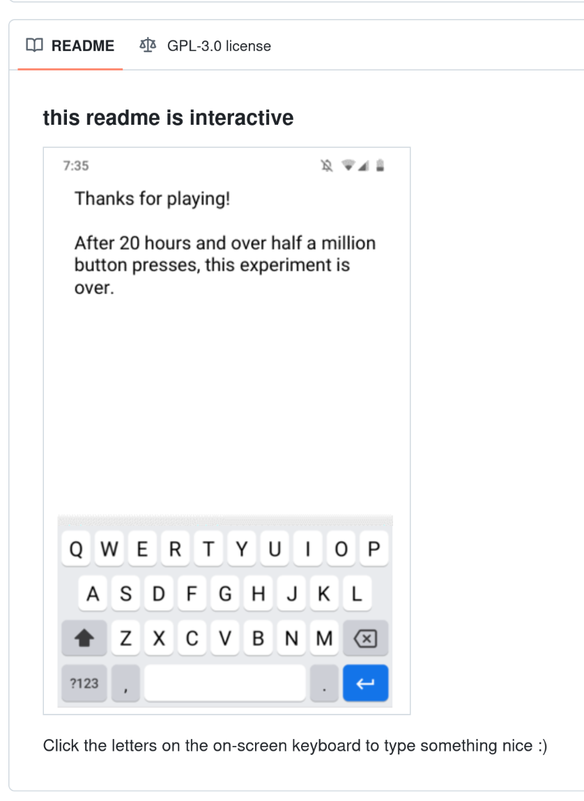
I explored these ideas in a project that gave everyone a shared text box. You can imagine what people started typing, which made me end it early:
What will you do with this power?
I hope you build something silly with this technique and show it to me! I bet this works really well with SVG, which is amenable to dynamic generation. I could see this being really annoying and/or useful for all the new bots that are analyzing and commenting on PRs, such as polylane.
And please remember to include descriptive alt attributes on every element that has a significant meaning. That way your UI remains accessible to blind users.